ButtonEdit
- 3 minutes to read
ButtonEdit is a text editor that allows you to display buttons within an edit box.
Implementation Details
ButtonEdit is realized by the ButtonEditExtension class. Its instance can be accessed via the ButtonEdit(ButtonEditSettings) helper method, which is used to add a ButtonEdit extension to a view. This method’s parameter provides access to the ButtonEdit‘s settings, implemented by the ButtonEditSettings class, allowing you to fully customize the extension.
The ButtonEdit‘s client counterpart is represented by the ASPxClientButtonEdit object.
Declaration
ButtonEdit can be added to a view in the following manner.
View code (ASPX):
<script type="text/javascript">
    function buttonEdit1_ButtonClick(s, e) {
        switch (e.buttonIndex) {
            case 0:
                s.SetText("");
                break;
            case 1:
                s.SetText("Some text");
                break;
        }
    }
</script>

<%
    Html.DevExpress().ButtonEdit(
        settings => {
            settings.Name = "buttonEdit1";

            settings.Text = "Some text";
            settings.Width = 200;
            settings.Properties.Buttons.Add("Clear");
            settings.Properties.Buttons.Add("Fill");
            settings.Properties.ClientSideEvents.ButtonClick = "buttonEdit1_ButtonClick";
        }
    )
    .Render();
%>
View code (Razor):
<script type="text/javascript">
    function buttonEdit1_ButtonClick(s, e) {
        switch (e.buttonIndex) {
            case 0:
                s.SetText("");
                break;
            case 1:
                s.SetText("Some text");
                break;
        }
    }
</script>

@Html.DevExpress().ButtonEdit(
    settings => {
        settings.Name = "buttonEdit1";

        settings.Text = "Some text";
        settings.Width = 200;
        settings.Properties.Buttons.Add("Clear");
        settings.Properties.Buttons.Add("Fill");
        settings.Properties.ClientSideEvents.ButtonClick = "buttonEdit1_ButtonClick";
    }).GetHtml()
Note
The Partial View should contain only the extension’s code.
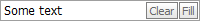
The code result is demonstrated in the image below.
Main Features
Null Prompt Text
The prompt text can be displayed if the editor’s value is null and the editor is not focused. The prompt text disappears when the editor receives focus. You can define the prompt text via the ButtonEditSettings.Properties.NullText (ButtonEditProperties.NullText) property.
Mask Password Input
You can treat the input as a password, so the characters entered into the editor are masked. To enable this functionality, set the ButtonEditSettings.Properties.Password (ButtonEditProperties.Password) property value to true.
Mask Input
The ButtonEdit extension allows you to use masks during editing. See the Mask Editing topic to learn more.
Button Templates
You can create a template that defines the common manner in which all editor buttons are rendered.
Built-in Validation
The ButtonEdit extension allows you to perform data validation both on the client and server side. See the Built-in Validation topic to learn more.
Customizable Button Layout and Look-and-Feel
Each button can display text, an image, or both. You can control the button’s visibility, availability to end-users and position within the editor’s text box. You can use the ButtonEditSettings.Properties.Buttons (ButtonEditPropertiesBase.Buttons) property in order to manage the button collection.
You can customize the extension appearance using predefined built-in visual themes. See this topic to learn more: Applying Themes
Full-Featured Client-Side API
The ButtonEdit provides you with a comprehensive client-side API. This API is implemented using JavaScript and is exposed via the ASPxClientButtonEdit object. The ASPxClientButtonEdit object serves as the client-side equivalent of the ButtonEdit extension.