RoundPanel
- 2 minutes to read
The ASPxRoundPanel control is a container area with rounded corners.
The radius of the round panel’s corners can be specified by the ASPxRoundPanel.CornerRadius property.
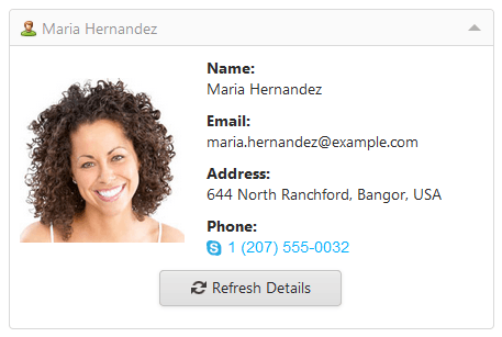
Panel Header
The round panel’s header visibility is controlled by the ASPxRoundPanel.ShowHeader property. The header’s text and image are specified by the ASPxRoundPanel.HeaderText and ASPxRoundPanel.HeaderImage properties, respectively.
You can specify a template for the entire panel header or the header content (the close button element remains) using the ASPxRoundPanel.HeaderTemplate or the ASPxRoundPanel.HeaderContentTemplate property.
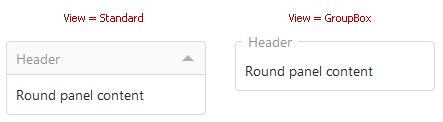
Panel Views
A round panel can be displayed in either view as a standard round panel or as a group box, based on the ASPxRoundPanel.View property value.
Panel Collapsing
End-users are allowed to collapse panels if the ASPxRoundPanel.View property is set to Standard. In this case, end-users can collapse and expand a panel using the collapse button, or by clicking the panel header provided when the ASPxRoundPanel.AllowCollapsingByHeaderClick property is set to true. You can use the ASPxRoundPanel.Collapsed property to specify whether or not the panel is collapsed.
On the client side, you can control the panel’s collapse state using the ASPxClientRoundPanel.GetCollapsed and ASPxClientRoundPanel.SetCollapsed methods.
Content Loading on Demand
The content of an initially collapsed round panel can be loaded when the panel is first expanded. Using postponed loading of panel content, you can enhance the response time of your web page on its initial load. To enable this functionality, set the ASPxRoundPanel.LoadContentViaCallback property to true. The loading panel is displayed while the content is uploading.