RoundPanel
- 2 minutes to read
The ASPxRoundPanel control is a container area with rounded corners.
You can use the ASPxRoundPanel.CornerRadius property to specify the radius of the round panel’s corners.
Panel Header
The ASPxRoundPanel.ShowHeader property defines the visibility of the round panel’s header. To specify the header’s text and image, use the ASPxRoundPanel.HeaderText and ASPxRoundPanel.HeaderImage properties.
You can use the ASPxRoundPanel.HeaderTemplate property to specify a template for the entire panel header. To define a template for the header content (except for the collapse button element), use the ASPxRoundPanel.HeaderContentTemplate property.
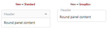
Panel Views
The ASPxRoundPanel.View property allows you to display the round panel as a standard round panel or as a group box.
Collapse Panels
Users can collapse panels if the ASPxRoundPanel.View property is set to Standard. To collapse or expand a panel, users can click its collapse button. You can set the ASPxRoundPanel.AllowCollapsingByHeaderClick property to true to allow users to click the panel header to collapse the panel. Use the ASPxRoundPanel.Collapsed property to specify whether the panel is collapsed.
On the client side, you can call the ASPxClientRoundPanel.SetCollapsed method to programmatically collapse or expand the panel. To get the panel’s collapse state, use the ASPxClientRoundPanel.GetCollapsed method.
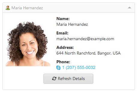
Content Loading on Demand
The initially collapsed round panel can load its content when a user first expands this panel. If you postpone the panel’s content load, you can shorten the response time of your web page on its initial load. To enable this functionality, set the ASPxRoundPanel.LoadContentViaCallback property to true. ASPxRoundPanel displays a loading panel when it loads content.