Information Presentation Basics
- 4 minutes to read
The Pivot Grid has been designed to convert lengthy table data into compact reports that display summarized data, and can easily be customized by end-users to achieve the desired layout. These compact reports bring you the functionality of Pivot Tables that are available in such applications as Microsoft Access or Microsoft Excel. At the same time, they bring you visual consistency with the rest of our advanced controls and eliminate the need to have anything but totally managed controls in your applications.
What Kind of Data is Used as the Source for the ASPxPivotGrid
To see how the ASPxPivotGrid> converts raw table data into a flexible report, imagine a car sales database with the following structure:
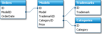
The main data we are interested in is contained in the Orders table. Each record in this table is a single car purchase.
Data tables, like the Orders table in our example, are often referred to as Fact Tables. This is because such tables contain the facts that took place, and will be analyzed. The remaining tables are simply needed to obtain human-readable information. In our example, they are needed to get the car model name or car category using the car ID stored within the fact table. They wouldn’t be needed if a user could identify cars by their IDs. These additional tables are usually called Dimension Tables.
To get human-readable information about car sales, we can merge data from all the tables into a single query. And this is how this data would look if displayed by the Grid View or another grid control:
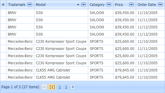
The number of records in such a query will match the number of records in the fact table. In our example, the number of records will match the number of car orders, and the number of cars sold (since each record in the Orders table is a single car purchase). If we need to analyze car sales over a long period, say several years, we can get numerous records which are almost impossible to analyze using traditional grid controls.
If you wish to see how sales have changed over time, you will probably be most interested in changes that took place from month to month or even from year to year. Another data analysis alternative is to see which car model has the best sales. In either case, you would like to compare summaries calculated against groups of related records. You can obtain such values even when using traditional grid controls, but with the ASPxPivotGrid less effort is needed, and the resulting reports are much more compact and easier to analyze.
ASPxPivotGrid Compared to Traditional Grid Controls
As with other data-aware controls, the ASPxPivotGrid requires you to create a number of fields - objects bound to real data source fields. The fields whose data you need to analyze (sales amount in our sample) should be placed in the data area. Then, place some fields in the row and column area. For instance, if you wish to know how many models of a particular type were sold on a certain date, you can place the Model and OrderDate fields in those areas.
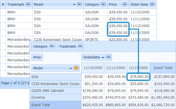
The image below shows you how raw table data is transformed into a compact report that allows data to be easily analyzed.
ASPxPivotGrid Compared to a 3D Chart
The pivot report can also generally be compared to a three-dimensional chart. If you analyze car sales data, you will have car models on one axis, time on another axis and sales volume on the third. In terms of the ASPxPivotGrid, you could have the car model field in the column area, purchase date field in the row area and the sales amount calculated for each column and row intersection.
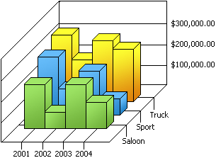
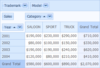
For example, take a look at the following 3D chart that shows the changes in sales over years for different car categories.
The ASPxPivotGrid can display the same data in the following format.
Note
Each column and row intersection in the ASPxPivotGrid can contain more than one cell. For instance, in the example above you can show the number of cars sold in addition to the sales volume. To achieve such multi-summary layouts, simply place several fields in the data area. For more information about this feature, refer to the Data Cell Layout document.