Using Custom CSS Sprites
- 3 minutes to read
If you use custom images for DevExpress control elements in your web application, you should manually combine these images into a sprite image to benefit from the CSS sprites technique. Depending on the application’s logic, you can combine images into a single (application specific) sprite image or multiple (control or product line specific) sprite images.
For each DevExpress control, set the required sprite image (and individual images contained within it) via one of the following approaches.
Via a control’s properties
Use the following properties to attach a sprite image to a control to display a sprite’s parts for the control elements:
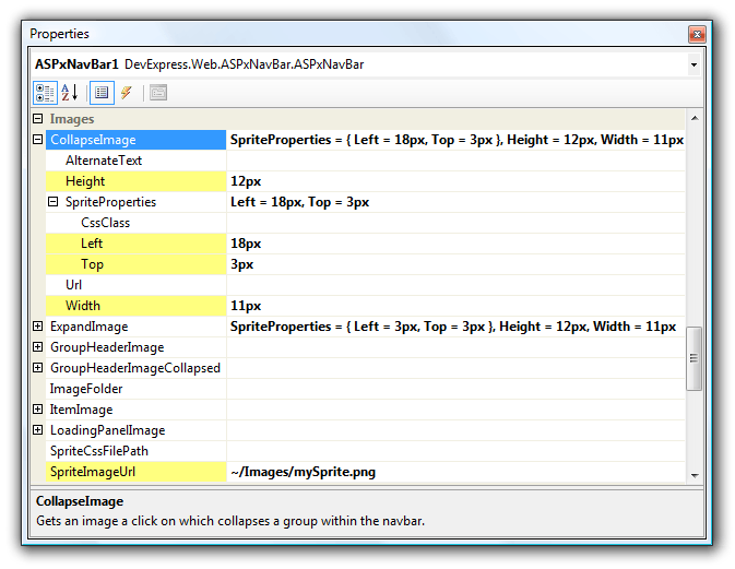
- SpriteImageUrl - Specifies the path to a sprite image.
- Height - Specifies the height of a separate element’s image.
- Width - Specifies the width of a separate element’s image.
- Top - Specifies thehe vertical offset within a sprite for a separate element’s image.
- Left - Specifies the horizontal offset within a sprite for a separate element’s image.
The following image demonstrates the Properties Window with its properties as defined for the ASPxNavBar and its CollapseImage:
Note
Notice that individual image settings are rendered as inline CSS styles embedded into an image’s HTML tag. If too many images are defined via this approach, it may result in an increase in page size which might affect application performance.
When a sprite and its associated images are defined via a control’s properties, markup is added to the page. The code below illustrates the HTML markup generated for the ASPxNavBar’s collapse image.
<img class="dxWeb_nbCollapse"
     style="background: transparent url(Images/mySprite.png) no-repeat scroll -18px -3px;
         border-width: 0px; height: 12px; width: 11px; -moz-background-clip: -moz-initial;
         -moz-background-origin: -moz-initial; -moz-background-inline-policy: -moz-initial;"
     alt="" src="/Projects/ImageSprites_Test1/DXR.axd?r=1_16"/>
Notice that individual image settings are rendered as inline CSS styles embedded into an image’s HTML tag. If many images are defined via this approach, it may result in an increase in page size, which may affect application performance.
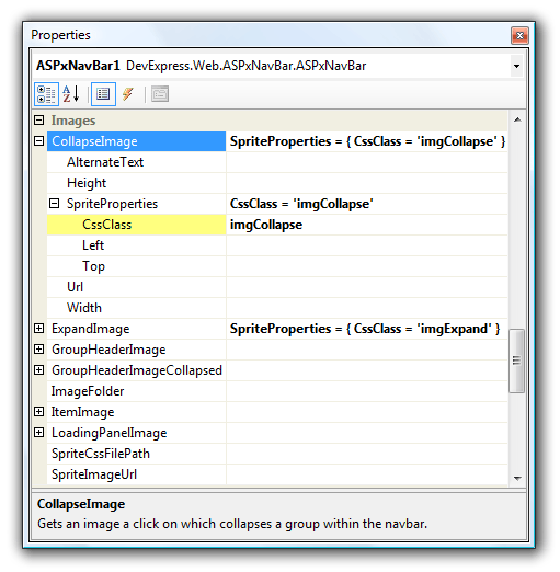
Via named CSS classes
You can define individual image settings using named CSS classes (which can be declared within the page markup or a linked CSS file) via the ImageSpriteProperties.CssClass property.
Each CSS class should contain attributes that specify the size of each image in the sprite (width and height, in pixels) and position within the sprite (horizontal and vertical offsets represented by negative values).This is the recommended approach when referring to a sprite image using CSS rules.
<html xmlns="http://www.w3.org/1999/xhtml" >
<head runat="server">
    <title>Custom CSS Image Sprite</title>

    <style type="text/css">
        .imgExpand,
        .imgCollapse {
            background-image: url('Images/nb-custom-sprite.png');
            background-repeat: no-repeat;
            background-color: transparent;
        }
        .imgExpand {
            background-position: -3px -3px;
            width: 11px;
            height: 12px;
        }
        .imgCollapse {
            background-position: -18px -3px;
            width: 11px;
            height: 12px;
        }
    </style>
</head>
<body>
    <form id="form1" runat="server">

        <dx:ASPxNavBar ID="ASPxNavBar1" runat="server" >
            <Groups>
                <dx:NavBarGroup Text="Group 1">
                    <Items>
                        <dx:NavBarItem Text="Item 1-1"></dx:NavBarItem>
                        <dx:NavBarItem Text="Item 1-2"></dx:NavBarItem>
                    </Items>
                </dx:NavBarGroup>
                <dx:NavBarGroup Text="Group 2" Expanded="False">
                    <Items>
                        <dx:NavBarItem Text="Item 2-1"></dx:NavBarItem>
                    </Items>
                </dx:NavBarGroup>
            </Groups>
            <CollapseImage>
                <SpriteProperties CssClass="imgCollapse" />
            </CollapseImage>
            <ExpandImage>
                <SpriteProperties CssClass="imgExpand" />
            </ExpandImage>
        </dx:ASPxNavBar>

    </form>
</body>
</html>
The following code shows how the ASPxNavBar’s collapse image (defined via a named CSS class) is rendered in the page’s HTML markup.
<img class="imgCollapse" style="border-width: 0px;" alt="" src="/Projects/ImageSprites_Test1/DXR.axd?r=1_16"/>
This approach uses the control’s SpriteImageUrl property to refer to a sprite image instead of defining it via CSS rules. Note that in this case, inline CSS settings are automatically rendered in each HTML image tag to define a sprite image, which increases the page size and overrides ‘background-position’ attributes for custom CSS classes. Be sure to add the ‘!important;’ declaration to the ‘background-position’ CSS attributes in this case.