ASPxDateNavigator
- 3 minutes to read
This topic describes the ASPxDateNavigator control’s main features and its visual elements. The settings that specify the element’s visibility, content and appearance are listed below.
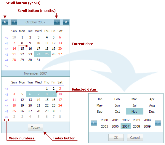
The following picture illustrates the DateNavigator control. The fast navigation panel, invoked by clicking the month or year within the calendar’s header is shown at the arrow’s tip.
The DateNavigator control, when dropped onto a page, should be bound to the ASPxScheduler control via its ASPxSchedulerRelatedControlBase.MasterControlID property. It is used to synchronize the time range and selected dates with the Scheduler control.
The visual appearance of the DateNavigator can be customized via the ASPxDateNavigator.Properties object. It is an instance of the DateNavigatorProperties class, derived from the CalendarProperties.
End-users can select either a particular date, or a range of dates by means of the DateNavigator control. Selecting dates using the DateNavigator control results in displaying them by the SchedulerControl, to which it is linked.
| Action | Effect |
|---|---|
| Click any date in the DateNavigator calendar. | One day becomes selected, and the SchedulerControl displays it using the Day View. If the currently active view is of another type, it is automatically changed to Day View. The only exception is the Work Week View. In this instance, the entire work week is selected. |
| Click and drag across the DateNavigator calendar. | The continuous range of dates is selected. The SchedulerControl adjusts the currently active view to display the selected range of dates. If the selection is smaller than a week, the view type is switched to Day View. A week-long range is displayed using the Scheduler’s Full Week View. If the range is more than a week, then the Month View is used. |
| Hold down the CTRL key and click several dates. | A set of dates is selected. The SchedulerControl displays it using the Day View, irrespective of the size of the selected range. |
The table below lists the main properties which affect the appearance of the DateNavigator control:
Highlighting dates | Use the DateNavigatorProperties.AppointmentDatesHighlightMode property to highlight the ASPxDateNavigator dates that include appointments. The following highlight modes are available:
|
Today button | Use the DateNavigator.ShowTodayButton to display or hide the Today button. You can change its text via the CalendarProperties.TodayButtonText property. |
Week numbers | To display or hide week numbers use the CalendarProperties.ShowWeekNumbers property. |
Highlighting weekends | The rules for highlighting the weekends are specified by the CalendarProperties.HighlightWeekends property, that changes the font color to Red for holidays. |
Highlight the current date | Use the CalendarProperties.HighlightToday to highlight the current date. |
Names of the days of the week | Specify full, long or short format for the days’ names via the CalendarProperties.DayNameFormat. You can also hide them via the CalendarProperties.ShowDayHeaders property. |
Month and Year scroll buttons’ visibility | the CalendarProperties.EnableLargePeriodNavigation and CalendarProperties.EnablePeriodNavigation properties define the scroll buttons visibility. The date navigation becomes restricted to dates and months displayed in the control. |
Note
The CalendarProperties.MinDate and CalendarProperties.MaxDate properties are not in effect for the control.