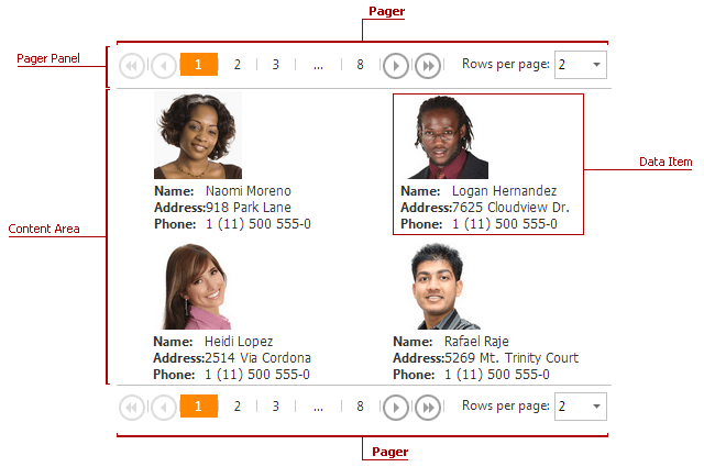
Pager
A Pager element allows users to navigate through the control’s data pages. It consists of “next”, “last”, “previous”, and “first” buttons, and an indicator that displays the current page number and the total number of pages. The Pager element is placed onto a Pager Panel.
The Pager can be attached to the top, bottom or both sides of the DataView control.
The table below lists the main members that affect the element’s appearance and functionality:
| Characteristics | Members |
|---|---|
| Alignment | ASPxDataViewBase.PagerAlign |
| General Settings | ASPxDataView.PagerSettings |
| Endless Paging Mode | DataViewPagerSettings.EndlessPagingMode |
| Style | ASPxDataViewBase.PagerStyle |