Legend Appearance
- 2 minutes to read
This document describes the ways in which the appearance of the legend can be customized at design time.
With the ASP.NET Chart Control, it is possible to completely customize the legend’s appearance in a large variety of ways, which are described below.
- To show or hide items’ markers within the legend, use the Legend.MarkerVisible property.
- To define the size of the legend markers (in pixels), use the Legend.MarkerSize property.
- To use check boxes instead of markers or together with them for all legend items, set the Legend.MarkerMode property to the MarkerAndCheckBoxes or CheckBoxesAndMarkers value.
- To control the visibility of the legend itself, use the Legend.Visibility property.
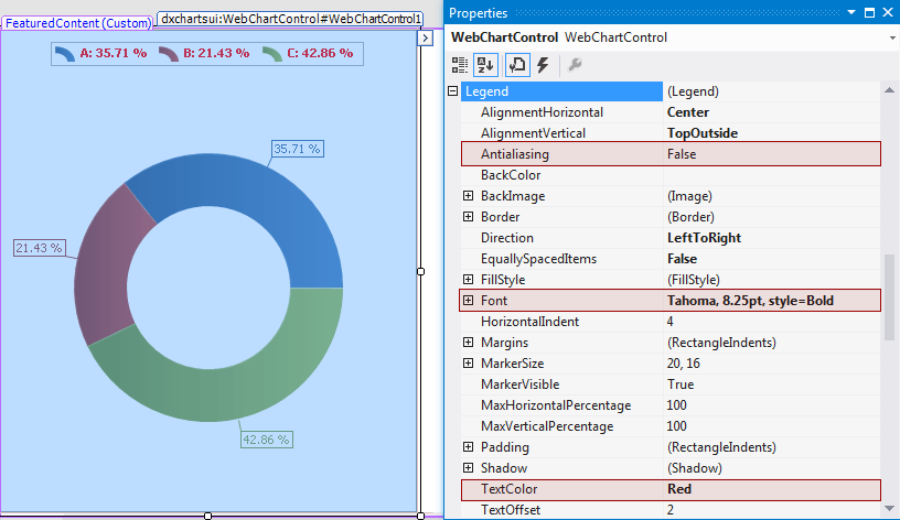
The appearance of the legend text can be customized via the following set of properties: Legend.Font, Legend.Antialiasing and Legend.TextColor.
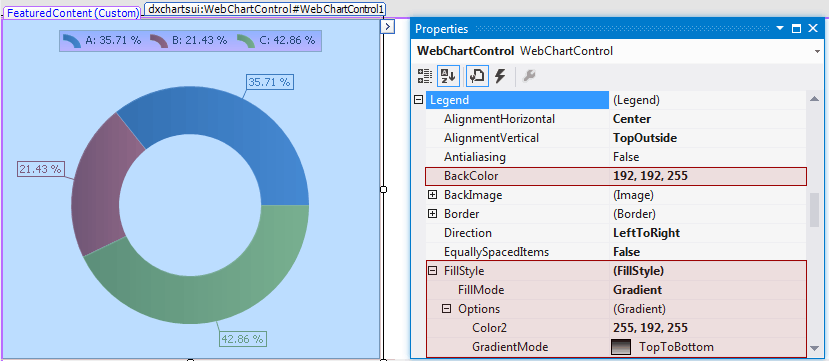
The appearance of the legend’s background is determined by the Legend.BackColor, Legend.BackImage and Legend.FillStyle properties.
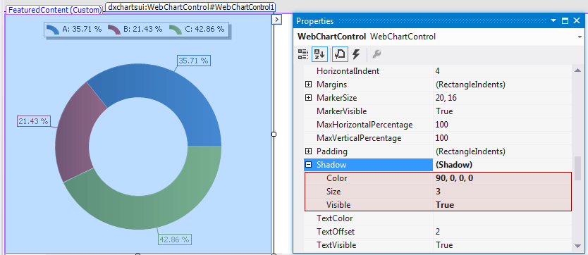
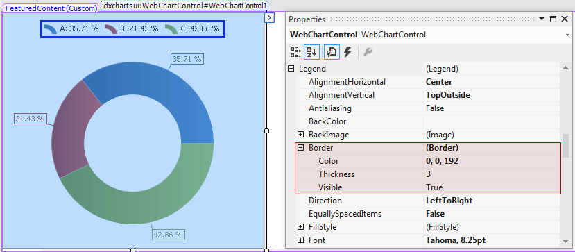
In addition, you can customize the appearance of the legend’s borders and shadow.
To access the legend border options, use the Legend.Border property. Then, you can customize their appearance, using the BorderBase.Color, BorderBase.Thickness and BorderBase.Visible properties.
To access the legend shadow options, use the LegendPageTab.Shadow property. Then, you can customize its appearance, using the Shadow.Color, Shadow.Size and Shadow.Visible properties.