Command Button
Command buttons are displayed within the command column’s cells and allow end-users to add and delete nodes, switch the TreeList to he edit mode, update data, etc. A command button represents a single command. For instance, the Delete button allows end-users to delete nodes. There are five command buttons: New, Edit, Delete, Update and Cancel. A command column allows multiple buttons to be displayed within a cell. A command button is represented by a link by default. It can also be represented by a button or image.
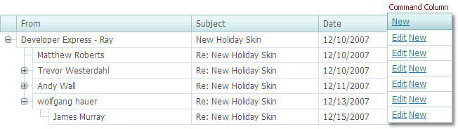
Command columns can also display custom buttons.
The table below lists the main members that affect element appearance and functionality.
Characteristics | Members |
|---|---|
Representation | TreeListCommandColumn.ButtonType (via MVCxTreeListCommandColumn.ButtonType) |
Accessibility | TreeListCommandColumn.NewButton (via MVCxTreeListCommandColumn.NewButton) TreeListCommandColumn.EditButton (via MVCxTreeListCommandColumn.EditButton) TreeListCommandColumn.DeleteButton (via MVCxTreeListCommandColumn.DeleteButton) TreeListCommandColumn.UpdateButton (via MVCxTreeListCommandColumn.UpdateButton) TreeListCommandColumn.CancelButton (via MVCxTreeListCommandColumn.CancelButton) TreeListCommandColumn.CustomButtons (via MVCxTreeListCommandColumn.CustomButtons) |
Action | ASPxClientTreeList.CustomButtonClick (via MVCxClientTreeList.CustomButtonClick) |
Visibility | TreeListCommandColumnButton.Visible (via MVCxTreeListCommandColumn.<Button Name>.Visible, e.g., MVCxTreeListCommandColumn.NewButton.Visible) |
Style | TreeListStyles.CommandButton (via TreeListSettings.Styles.CommandButton) |