Calendar
- 3 minutes to read
The ASPxCalendar control allows end users to select dates and navigate through months and years.
Main Features
Multiple Date Selection
End users can work in single or multiple date selection mode (the EnableMultiSelect property). In multiple date selection mode, users can select individual dates or a range of dates. To choose a range of dates, select the initial date and hold the left mouse button (or the Shift key) down while moving the mouse to the final date. Hold down the Ctrl key to add a date to or remove it from the selection. Click a week number to select the entire week.
Highlight Dates
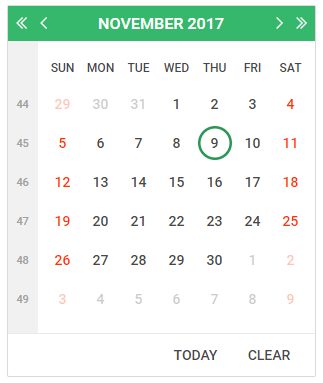
The HighlightToday and HighlightWeekends properties allow you to highlight today’s date and weekend days.
Customizable Appearance
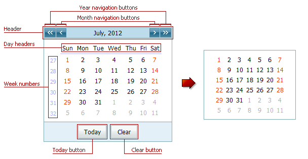
The following table lists API members you can use to customize the Calendar’s appearance:
| Element | Visibility | Appearance |
|---|---|---|
| Today Button | ShowTodayButton | ButtonStyle |
| Clear Button | ShowClearButton | ButtonStyle |
| Week Numbers | ShowWeekNumbers | WeekNumberStyle |
| Day Headers | ShowDayHeaders | DayHeaderStyle |
| Header | ShowHeader | HeaderStyle |
| Month Navigation Buttons | EnablePeriodNavigation | NextPeriodImage, PrevPeriodImage |
| Year Navigation Buttons | EnableLargePeriodNavigation | NextLargePeriodImage, PrevLargePeriodImage |
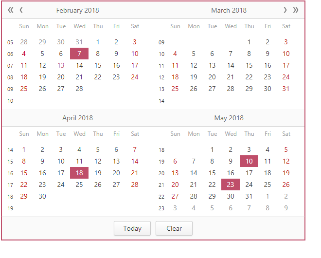
Multi-Month View
The Calendar control can display multiple months and organize them in several rows and columns. The Columns and Rows properties allow you to define the number of columns and rows.
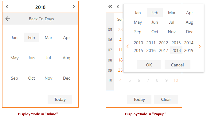
Month-Year Picker Mode
The Month-year Picker mode allows you to specify which date component an end user can select: a day, a month or a year. You can click the header to change the calendar view (fast navigation). Use the following settings to specify how users select dates and restrict the available calendar views:
| Property | Description |
|---|---|
| PickerType | Specifies a date component an end user can select (a day, month or year). |
| InitialView | Specifies the initial Calendar view. |
| MaxView | Specifies the earliest available Calendar view. For example, if the MaxView property is set to Months, the picker displays the months of a particular year and January is the earliest available Calendar view item. |
Inline Navigation
The Calendar can display the fast navigation panel in the editor or popup window (the DisplayMode property).
Render Custom Days
You can customize each calendar day’s appearance before the browser renders a page.
Built-in Validation
The Calendar control allows you to validate data on the client and server sides. Refer to the following topic for more information: Validation.
Client-Side APIs
The ASPxClientCalendar object is the client-side equivalent of the ASPxCalendar control. This object exposes the control’s comprehensive client-side API.
| Method | Description |
|---|---|
| ClearSelection | Deselects all selected dates. |
| DeselectDate(date) | Deselects the specified date. |
| DeselectRange(start, end) | Deselects the range of dates. |
| GetMaxDate | Gets the earliest date a user can select. |
| GetMinDate | Gets the furthest date a user can select. |
| GetSelectedDate | Returns the selected date. |
| SetSelectedDate(date) | Sets the calendar’s selected date. |
| GetSelectedDates | Gets a list of selected dates. |
| GetVisibleDate | Gets the date (day, month, year) that the calendar displays. |
| IsDateSelected(date) | Specifies whether the specified date is selected. |
| SelectDate(date) | Selects the specified date. |
| SelectRange(start, end) | Selects the specified range of dates. |
| SetMaxDate(date) | Sets the calendar’s furthest date an end user can select. |
| SetMinDate(date) | Sets the calendar’s earliest date an end user can select. |
| SetSelectedDate(date) | Sets the calendar’s selected date. |
| SetVisibleDate(date) | Sets the date (day, month, year) the calendar displays. |