Chart Elements
- 3 minutes to read
This topic explains the basic terms used in charting and provides general information about chart elements.
The image below illustrates the basic elements of a chart. The number of elements displayed in a chart is determined by the chart layout. When you create a chart, the ASPxSpreadsheet control uses a default layout, which displays some elements and hides others. You can select another layout to display a different arrangement of chart elements. To do this, click the existing chart to display the Chart Tools contextual tab. On the Design tab, in the Chart Layouts group, select one of the predefined layouts. (For more information, refer to the Applying a Predefined Chart Layout and Style topic.) You can also add required elements manually using the Layout tab, as described below (see the corresponding element). For details on how to specify your own chart layout, see the Modifying a Chart Manually document.
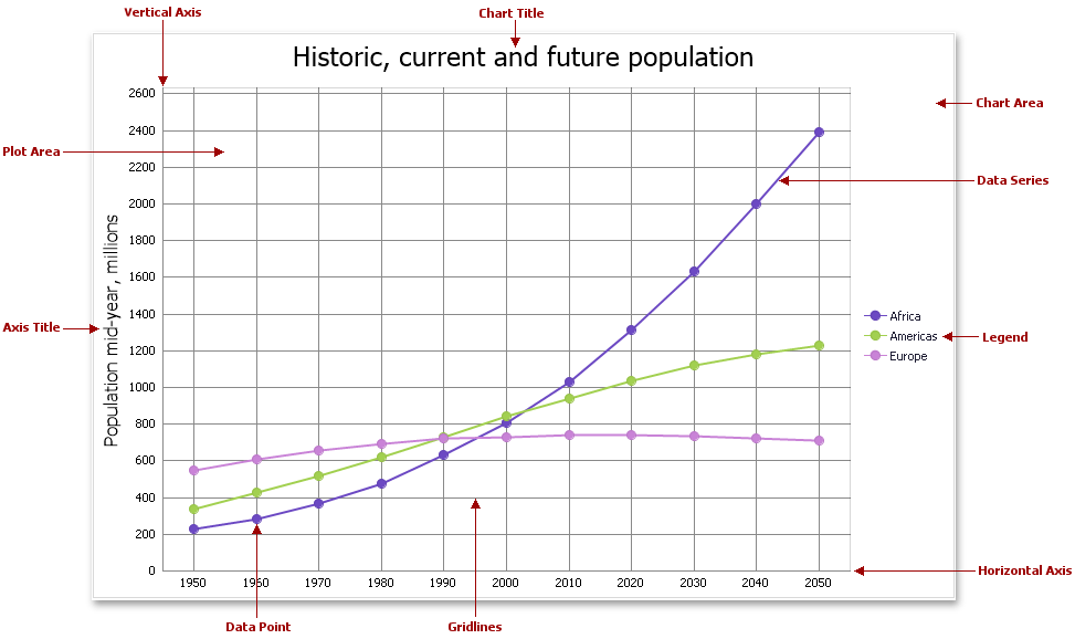
Chart elements include:
- Chart Area - represents the entire chart and all of its elements.
- Plot Area - the chart’s background in which data series, axes, gridlines and data labels are displayed.
- Data Point - a single value plotted on a chart. Each data point must have one argument and at least one value that corresponds to it. In general, the pairing of an argument and its value is represented on a diagram’s axes as their X and Y coordinates, respectively. A group of data points of the same color represents a single series.
- Data Series - a grouping of related data points. Each data series is identified by a unique color, which allows you to differentiate between data series when multiple series are plotted on a chart.
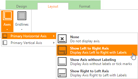
Horizontal and Vertical Axes - two perpendicular lines that run along each edge of the chart and determine the scale of measurements used. Most charts have two axes: the category axis (X-axis), usually running horizontally along the bottom of the plot area, and the value axis (Y-axis), usually running vertically on the left side of the plot area. 3-D charts also have the depth (series) axis along which the series names are displayed.
To show or hide primary axes, on the Layout tab, in the Axes group, click the Axes button, and then specify the direction of the horizontal axis and scaling options for the vertical axis.
Legend - an explanatory component that identifies each data series with its color or fill pattern. You can only create one legend per chart.
To display the chart legend, in the Labels group, click the Legend button, and then select where to position the legend.
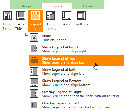
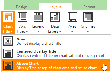
Chart Title - accompanies the chart with text headers and explanations. The chart title is always displayed at the top of the chart.
To add a title to your chart, in the Labels group, click the Chart Title button, and then select where to position the chart title.
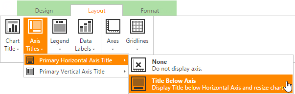
Axis Title - explanatory text used to label the axis.
To add axis titles, in the Labels group, click the Axis Titles button and select the required options for the horizontal and vertical axes.
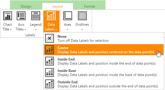
Data Label - identifies a single data point with its actual value.
To display data values on the chart, in the Labels group, click the Data Labels button, and then select where to position the data labels.
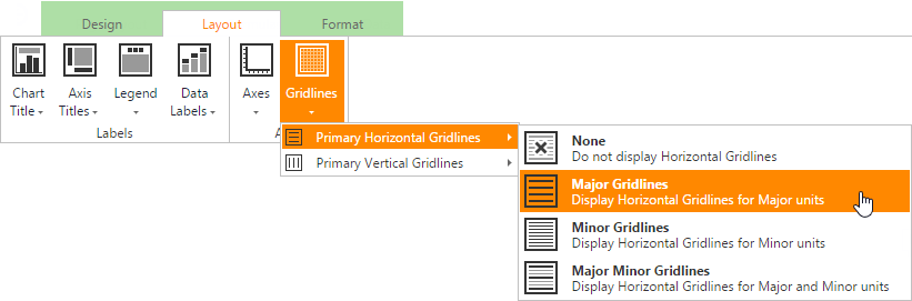
Gridlines - a series of horizontal and vertical lines running across the plot area, which provide information about the value of each point.
To display chart gridlines, in the Axes group, click the Gridlines button and select the type of gridlines you wish to display.