Card View Header Filter
- 4 minutes to read
The ASPxCardView control implements a column header filter that displays a dropdown list of all unique values within a column.
The following properties specify the filter button’s availability:
- ShowHeaderFilterButton
- Controls visibility of every column’s filter button.
- AllowHeaderFilter
- Controls visibility of a specific column’s filter button.
Users can enter text in the filter editor above the list to filter list items. To hide the filter editor, set the ShowHeaderFilterListBoxSearchUI property to false.
When you apply a filter to a column, the other header filters display values that relate to the specified filter criteria. Hold down Shift and click the header filter button to show the full list of values.
Filter Modes
Use the Mode property to specify a column’s filter mode. You can set the following filter modes for a grid data column.
- List
- The header filter is displayed as a regular list of filter items. Clicking an item invokes a corresponding action and automatically closes the dropdown.
- CheckedList
- The header filter is displayed as a checked list of filter items. In this mode, an end-user can select more than one item simultaneously. When the dropdown window is closed by clicking the OK button, the grid will display those records that contain the checked values.
- DateRangeCalendar
- (For date columns only). The header filter displays a calendar and a set of predefined items. Use the SettingsHeaderFilter.DateRangeCalendarSettings property to customize the calendar settings.
- DateRangePicker
- (For date columns only). The header filter displays a date range picker and a set of predefined items. Use the SettingsHeaderFilter.DateRangePickerSettings property to customize the editor settings.
- NumericRangePicker
- (For numeric columns only). The header filter displays two spin editors and a track bar. Use the NumericRangeSpinEditSettings and NumericRangeTrackBarSettings properties to customize settings of the spin editors and track bar.
Custom Header Filter Items
The ASPxCardView control allows you to create custom filter values, define their filter criteria, and display these values within a column’s drop-down filter.
You can handle the following events to customize the header filter items:
- BeforeHeaderFilterFillItems
- Allows you to populate the header filter dropdown with custom items instead of default items.
- HeaderFilterFillItems
- Allows you to add custom header filter items to default items.
<dx:ASPxCardView ID="ASPxCardView1" OnHeaderFilterFillItems="ASPxCardView1_HeaderFilterFillItems" >
    <Settings ShowHeaderFilterButton="true" ShowHeaderPanel="true" />
    <Columns>
        <dx:CardViewTextColumn FieldName="ProductName" VisibleIndex="0" .>
        <dx:CardViewTextColumn FieldName="UnitPrice" VisibleIndex="1" .>
    </Columns>
</dx:ASPxCardView>
protected void ASPxCardView1_HeaderFilterFillItems(object sender, ASPxCardViewHeaderFilterEventArgs e) {
if (e.Column.FieldName != "UnitPrice") return;
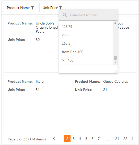
e.AddValue(String.Format("from {0} to {1}", 0, 100), string.Empty, String.Format("[UnitPrice] > {0} and [UnitPrice] < {1}", 0, 100));
e.AddValue(String.Format(">= {0}", 100), string.Empty, String.Format("[UnitPrice] >= {0}", 100));
}
Protected Sub ASPxCardView1_HeaderFilterFillItems(ByVal sender As Object, ByVal e As ASPxCardViewHeaderFilterEventArgs)
    If e.Column.FieldName <> "UnitPrice" Then Return
    e.AddValue(String.Format("from {0} to {1}", 0, 100), String.Empty, String.Format("[UnitPrice] > {0} and [UnitPrice] < {1}", 0, 100))
    e.AddValue(String.Format(">= {0}", 100), String.Empty, String.Format("[UnitPrice] >= {0}", 100))
End Sub
Result:
HTML Tags in an Item’s Text
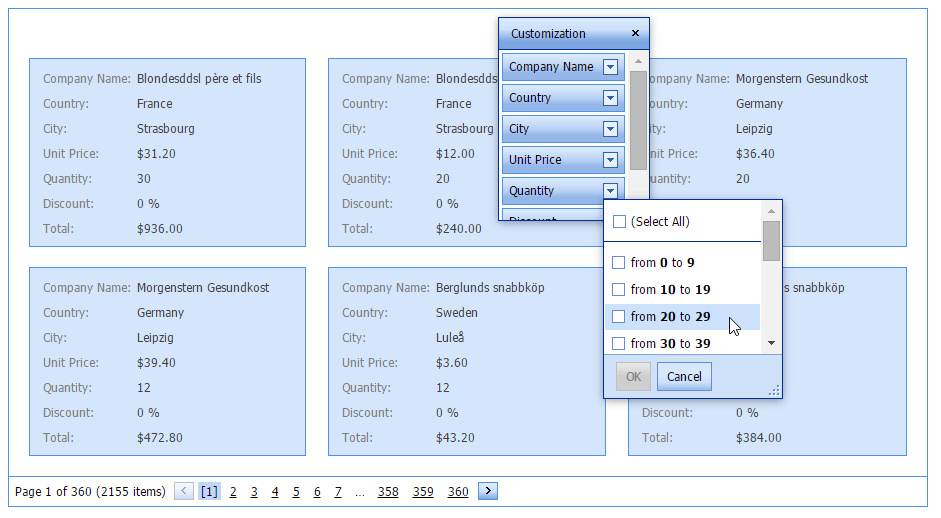
ASPxCardView’s header filter allows HTML tags in item text. The following example uses the HTML <b> tag within an item’s format pattern to highlight numbers in bold. The image below shows the result.
    protected void CardView_HeaderFilterFillItems(object sender, ASPxCardViewHeaderFilterEventArgs e) {
        if (e.Column.FieldName == "Total")
            PrepareTotalFilterItems(e);
        if (e.Column.FieldName == "Quantity")
            PrepareQuantityFilterItems(e);
    }
   ...
    protected virtual void PrepareQuantityFilterItems(ASPxCardViewHeaderFilterEventArgs e) {
        int max = 0;
        for(int i = 0; i < e.Values.Count; i++) {
            int value;
            if(!int.TryParse(e.Values[i].Value, out value)) continue;
            if(value > max) max = value;
        }
        e.Values.Clear();
        if(e.Column.Settings.HeaderFilterMode == HeaderFilterMode.List)
        e.AddShowAll();
        int step = 10;
        for(int i = 0; i < max / step + 1; i++) {
            int start = step * i;
            int end = start + step - 1;
            e.AddValue(string.Format("from <b>{0}</b> to <b>{1}</b>", start, end), "", string.Format("[Quantity] >= {0} and [Quantity] <= {1}", start, end));
        }
    }