Combo Box
- 2 minutes to read
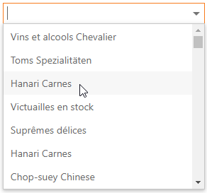
The ASPxComboBox editor combines the functionality of a text editor, button editor, and drop-down list editor. The editor’s drop-down menu displays a list of items that users can select.
Features
Bind to Data (More details)
The editor can automatically bind to data source fields or you can specify the fields.
Database Server Mode (More details | See demo)
The editor loads only required items to the server memory and executes data operations at the data source level.
Item Load Modes (More details)
The ASPxComboBox supports the following item load modes: Default, On-Demand, and Dynamic.
Incremental Filtering (More details | See demo)
The ASPxComboBox filters data while a user types the filter string.
Custom Filtering (More details | See demo)
You can filter items by multiple words and columns, or use diacritic characters in the filter string.
Display Format (More details | See demo)
The ASPxComboBox allows you to define a pattern to display the selected item’s text.
Multi-Column Mode (More details | See demo)
The ASPxComboBox allows you to display a collection of data source fields as multiple columns in the drop-down list.
Item Images (More details | See demo)
The ASPxComboBox allows you to specify images for the editor’s items.
Item Appearance Customization (More details | See demo)
You can specify the style for the editor drop-down window’s cells and rows.
Item Template (More details | See demo)
The ASPxComboBox supports custom layouts for items.
Customizable Button Collection (More details)
The ASPxComboBox contains a customizable EditButton collection.
Built-in Validation (More details)
The ASPxComboBox supports the client-side and server-side validation.