Mobile Support
- 5 minutes to read
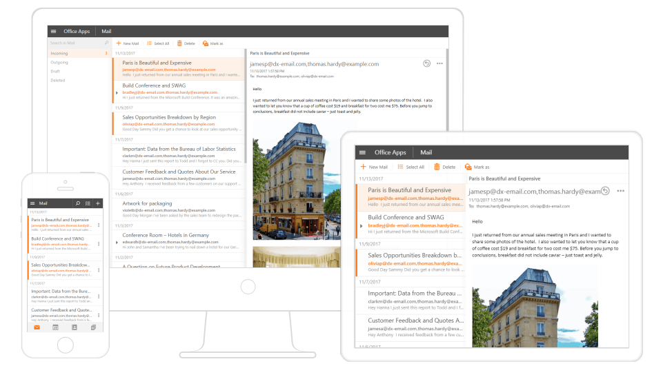
Mobile websites require touch-friendly UI elements and a layout that arranges content to fit a mobile browser window. DevExpress ASP.NET controls and MVC extensions provide features that transform a standard control’s UI into a mobile-optimized version on demand. These capabilities allow you to create a page layout that is tailored to desktop and mobile devices.
This topic provides basic information about mobile website development using DevExpress ASP.NET controls and consists of the following sections:
Common Concepts
The following practices and concepts can help you develop mobile web applications:
Mobile-Friendly Layouts
A mobile-friendly layout should fit a page’s content to the width of a browser’s window that can have any size and orientation. This means layouts should be flexible and adapt content to different devices. Two general approaches are used to create these layouts:
- Responsive web design - A common layout that resizes or reorders certain elements to fit the current window size.
- Adaptive web design - Different page layouts that are displayed depending on the current window size.
You can create adaptive or responsive page layouts or combine them using DevExpress ASP.NET controls and MVC extensions.
Viewport settings
A viewport is a web page’s visible part within a browser. Some web pages do not fit a mobile browser’s window, so it scales pages down to display them entirely within the viewport and enable end-users to scale up them. However, the mobile-friendly layouts are designed to display all content without scaling, so it is required to specify the viewport settings that prevent this.
You can configure the viewport using the meta tag that should be placed in the HTML document’s head section. We recommend using the following viewport settings:
<!DOCTYPE html>
<html>
<head>
    ...
    <meta name="viewport" content="user-scalable=0, width=device-width, initial-scale=1.0, maximum-scale=1.0" />
    ...
</head>
<body>
    ...
</body>
</html>
These settings stretch the page content to the viewport’s width and disable automatic and custom scaling.
Refer to the Using the viewport meta tag to control layout on mobile browsers to learn more about the viewport.
CSS 3 Media Queries
Media queries allow you to apply CSS styles depending on the viewport size. Use media queries to rearrange or display/hide elements when the viewport’s width (or height) is more or less than a specified value.
The code below is a simple media query applied to the CSS class:
@media screen and (max-width: 1024px) {
  .hidden {
    display: none;
  }
}
Apply this class to a page element to hide it when the viewport’s width is less than 1024 px. You can apply a CSS class to a DevExpress control (or a control element) using its CssClass property:
<dx:ASPxButton runat="server" ID="button1" Text="Adaptive Button" CssClass="hidden"/>
Mobile-Friendly Controls
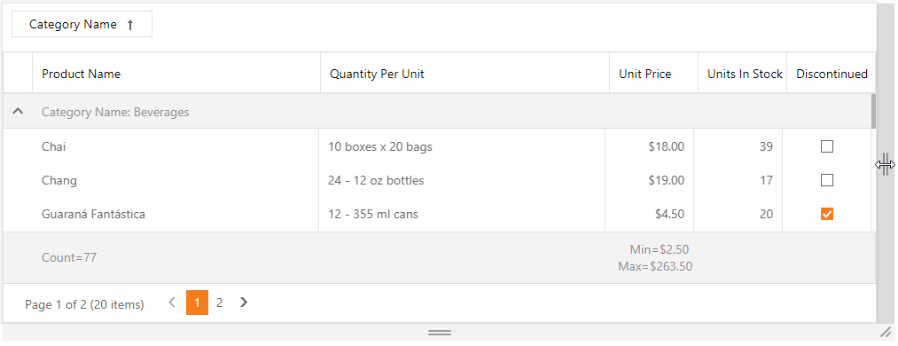
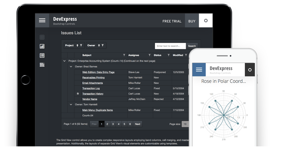
Most DevExpress ASP.NET Controls can be transformed to their mobile-friendly version by enabling built-in adaptivity modes. These modes make the control’s UI (or its part) touch-friendly and rearrange the control’s layout to fit the mobile browser window. In the following example, the Grid View control changes its UI when the browser’s window becomes too narrow to display content in the default mode:
You can access a control’s mobile-friendly modes via the corresponding control’s SettingsAdaptivity property (for example, ASPxGridView.SettingsAdaptivity for the ASP.NET WebForms Grid View or GridViewSettings.SettingsAdaptivity for the ASP.NET MVC Grid View Extension). The table below lists demos that demonstrate the mobile-friendly controls’ capabilities and the topics that describe the functionality that the SettingsAdaptivity property provides for each control.
Control | Demos | Topic |
|---|---|---|
Grid View | ||
Card View | ||
Spreadsheet | ||
Rich Edit | ||
Scheduler | ||
Form Layout | ||
Menu | ||
Panel | ||
Ribbon | ||
HTML Editor | ||
Popup | ||
File Manager |
Note
Certain controls’ structural elements can have their own mobile-friendly settings. Their parent controls expose detached SettingsAdaptivity properties (for example, GridCustomizationDialogPopupSettings.SettingsAdaptivity for the Grid View’s Customization Dialog). Their mobile-friendly functionality is described in the parent control’s topic.
Bootstrap Support
DevExpress ASP.NET Webforms controls and MVC extensions could be combined with the Bootstrap’s predefined classes if you included the Bootstrap library in your project.
The DevExpress ASP.NET subscription includes Bootstrap Web Forms, and Bootstrap ASP.NET Core controls that support mobile-friendly Bootstrap themes and adaptivity by design.
Other Capabilities
The DevExpress ASP.NET subscription includes additional tools and resources that can help you develop a mobile-friendly web application.
Template Gallery
The DevExpress ASP.NET Template Gallery provides a Responsive Web Application project template that you can use to create responsive web applications. This project template is available for MVC and WebForms.
You can also select the Bootstrap Web Application project template if you want to use the DevExpress ASP.NET WebForms Bootstrap controls.
DevExpress Themes
The DevExpress Themes contain the following mobile-optimized themes that include UI elements tailored to fit the average fingertip size, making them touch-friendly:
- iOS
- Material
- MaterialCompact
- Moderno
- Mulberry
- Office 365
You can also modify DevExpress Themes.