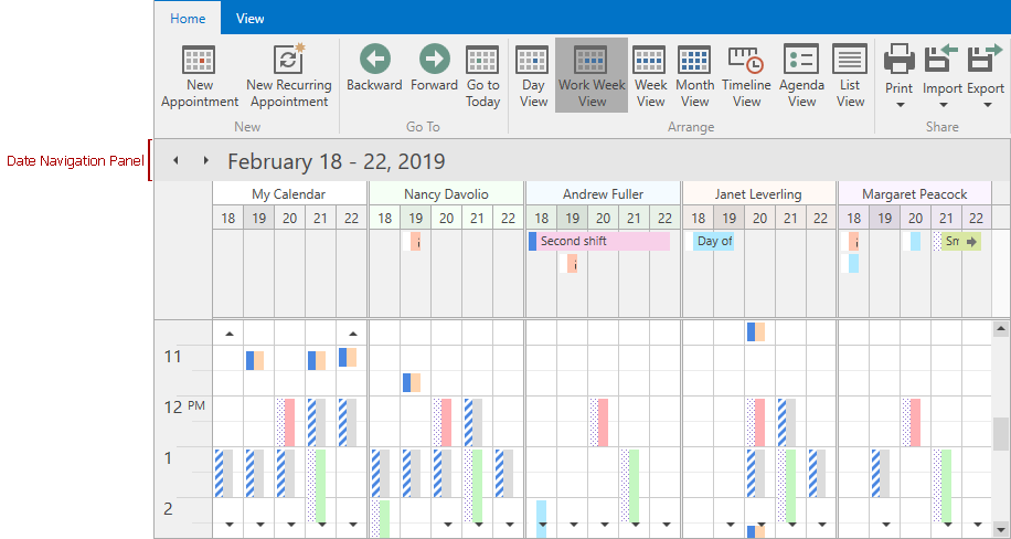
Date Navigation Panel
- 2 minutes to read
The DateNavigationPanel indicates the current time interval and displays navigation buttons.
To show the default Date Navigation Panel, set the SchedulerControl.ShowDateNavigationPanel property to true.
To modify the Date Navigation Panel, add a standalone DateNavigationPanel element to your application and use its DateNavigationPanel.Scheduler property to bind it to a SchedulerControl.
The example below illustrates how to hide navigation buttons and rotate the panel to display it to the left of the Scheduler.
     <Window.Resources>
        <Style TargetType="{x:Type dxsch:DateNavigationPanel}">
            <Setter Property="TextBlockStyle">
                <Setter.Value>
                    <Style TargetType="{x:Type TextBlock}">
                        <Setter Property="LayoutTransform">
                            <Setter.Value>
                                <RotateTransform Angle="-90" />
                            </Setter.Value>
                        </Setter>
                    </Style>
                </Setter.Value>
            </Setter>
        </Style>
    </Window.Resources>
    <!---->
    <dxsch:DateNavigationPanel x:Name="dateNavigationPanel" ShowButtons="False" Scheduler="{Binding ElementName=scheduler}"/>
    <dxsch:SchedulerControl x:Name="scheduler" />
Tip
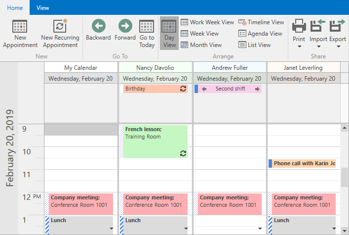
The Date Navigation Panel is automatically hidden in the List View. The standalone DateNavigationPanel hides the text and navigation buttons but preserves the width and height.
The format of the text displayed in the panel depends on the DisplayMode property value, how many time units the interval spans, and the corresponding format string. The default values of format strings depend on the current culture. To learn about cultures, see the CultureInfo Class topic in MSDN.
DisplayMode | Formatting property | ||||||||
|---|---|---|---|---|---|---|---|---|---|
Day |
| ||||||||
Month |
|